Wednesday, October 28, 2009

Final Design


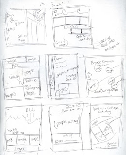
When you first look at my design for the course catalog you are welcomed by a hornet, which represents our school mascot. The images on the left hand side show what you would see at Broome Community College if you were a student. I believe that the image of the hornet helps keep the cover more interesting as opposed to the cartoon version of the hornet. With the "rule of thirds", I didn't want to put anything in the middle, all the images work around the image of the hornet. For the principles of design, all five of them are being represented. The design has a good balance and flow with the style of fonts and the accents of color. The emphasis of the whole design is the hornet, which jumps out as the main focus. Color is not a big role in my design, i just used the colors that represented the color, black, gold, and white. Which all three seemed to work out pretty well.

First Round Thumbnails

Monday, October 5, 2009


To begin this project I went through the fonts in illistrator to see which ones appealed to my eye. The fonts I eneded up chooseing where bernard MT Condensed, Curlz, Myriad Pro and Rockwell. I used these fonts because I liked how they had a certain uniqueness to them. I enjoyed to smooth curves and fun shapes each letter made. I didn't have a true explination to the letters I choose, I just used whatever looked good. The shapes that where contained within the fonts did't see to have anything unique about them so in order to make a something out of the letters I used the "direct select" tool to drag the letters into a form. In the Bottom right corner that shape was actually the counter form of the "i" that is used at the top under the "f". I thought it made a interesting visual to the overall piece.
In order to stick with the rule of thirds in this design I tried to use all of the elements of design. First your eye starts at the focal point, which is a counter form of a lower case "h" in the Myraid Pro font. Then your eye goes to the counter for of what use to be a lower case "i", which was also in the Myraid Pro font. After that your eye leads you to the top where you see a capital "F" and a lower case "i". Within this process I wanted to use contrast by changing the oppaccity of a few of the letters.
Overall I think the piece is unique and fun. With the different shapes and the differences between the greys the image speaks for itself.